Below is some R code for visualizing measurement error across the GRE score scale, plotted against percentiles. Data come from an ETS report at https://www.ets.org/s/gre/pdf/gre_guide.pdf.
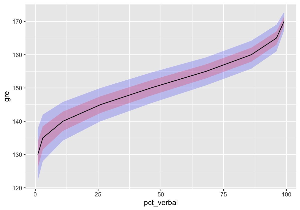
The plot shows conditional standard error of measurement (SEM) for GRE verbal scores. SEM is the expected average variability in scores attributable to random error in the measurement process. For details, see my last post.
Here, the SEM is conditional on GRE score, with more error evident at lower verbal scores, and less at higher scores where measurement is more precise. As with other forms of standard error, the SEM can be used to build confidence intervals around an estimate. The plot has ribbons for 68% and 95% confidence intervals, based on +/- 1 and 2 SEM.
# Load ggplot2 package
library("ggplot2")

# Put percentiles into data frame, pasting from ETS
# report Table 1B
pct <- data.frame(gre = 170:130,
matrix(c(99, 96, 99, 95, 98, 93, 98, 90, 97, 89,
  96, 86, 94, 84, 93, 82, 90, 79, 88, 76, 86, 73,
  83, 70, 80, 67, 76, 64, 73, 60, 68, 56, 64, 53,
  60, 49, 54, 45, 51, 41, 46, 37, 41, 34, 37, 30,
  33, 26, 29, 23, 26, 19, 22, 16, 19, 13, 16, 11,
  14, 9, 11, 7, 9, 6, 8, 4, 6, 3, 4, 2, 3, 2, 2,
  1, 2, 1, 1, 1, 1, 1, 1, 1),
  nrow = 41, byrow = T))

# Add variable names
colnames(pct)[2:3] <- c("pct_verbal", "pct_quant")

# Subset and add conditional SEM from Table 5E
sem <- data.frame(pct[c(41, seq(36, 1, by = -5)), ],
  sem_verbal = c(3.9, 3.5, 2.9, 2.5, 2.3, 2.1, 2.1,
    2.0, 1.4),
  sem_quant = c(3.5, 2.9, 2.4, 2.2, 2.1, 2.0, 2.1,
    2.1, 1.0),
  row.names = NULL)

# Plot percentiles on x and GRE on y with
# error ribbons
ggplot(sem, aes(pct_verbal, gre)) +
  geom_ribbon(aes(ymin = gre - sem_verbal * 2,
    ymax = gre + sem_verbal * 2),
    fill = "blue", alpha = .2) +
  geom_ribbon(aes(ymin = gre - sem_verbal,
    ymax = gre + sem_verbal),
    fill = "red", alpha = .2) +
  geom_line()